Velora Engagement Engine
UX case study redesigning an internal audience-building tool to make advanced segmentation usable for non-technical marketers.
The tool supports API-driven audience definitions but previously required technical knowledge, external documentation, and manual workarounds to use effectively.
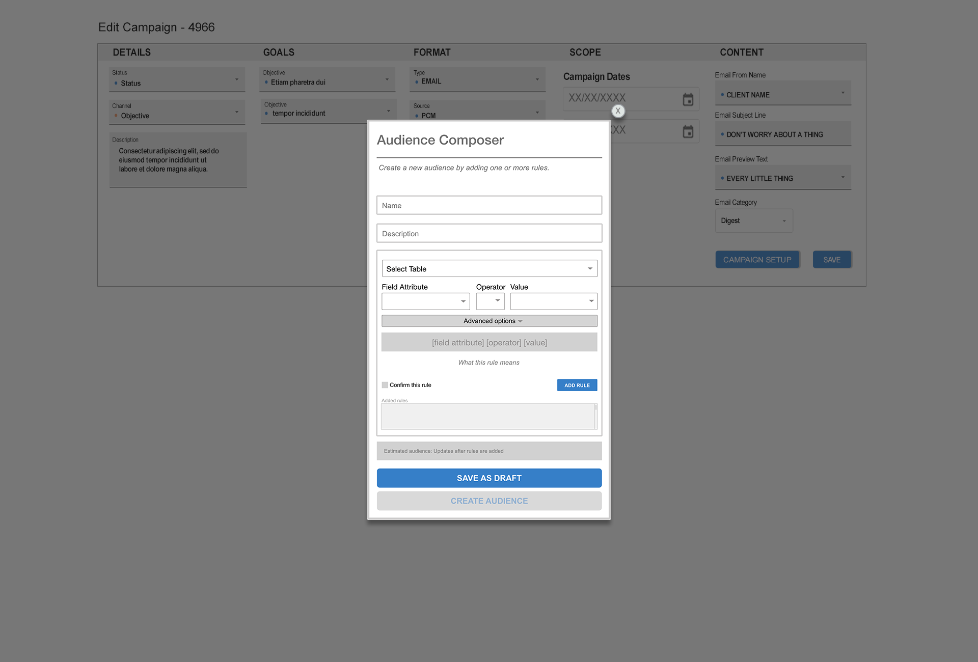
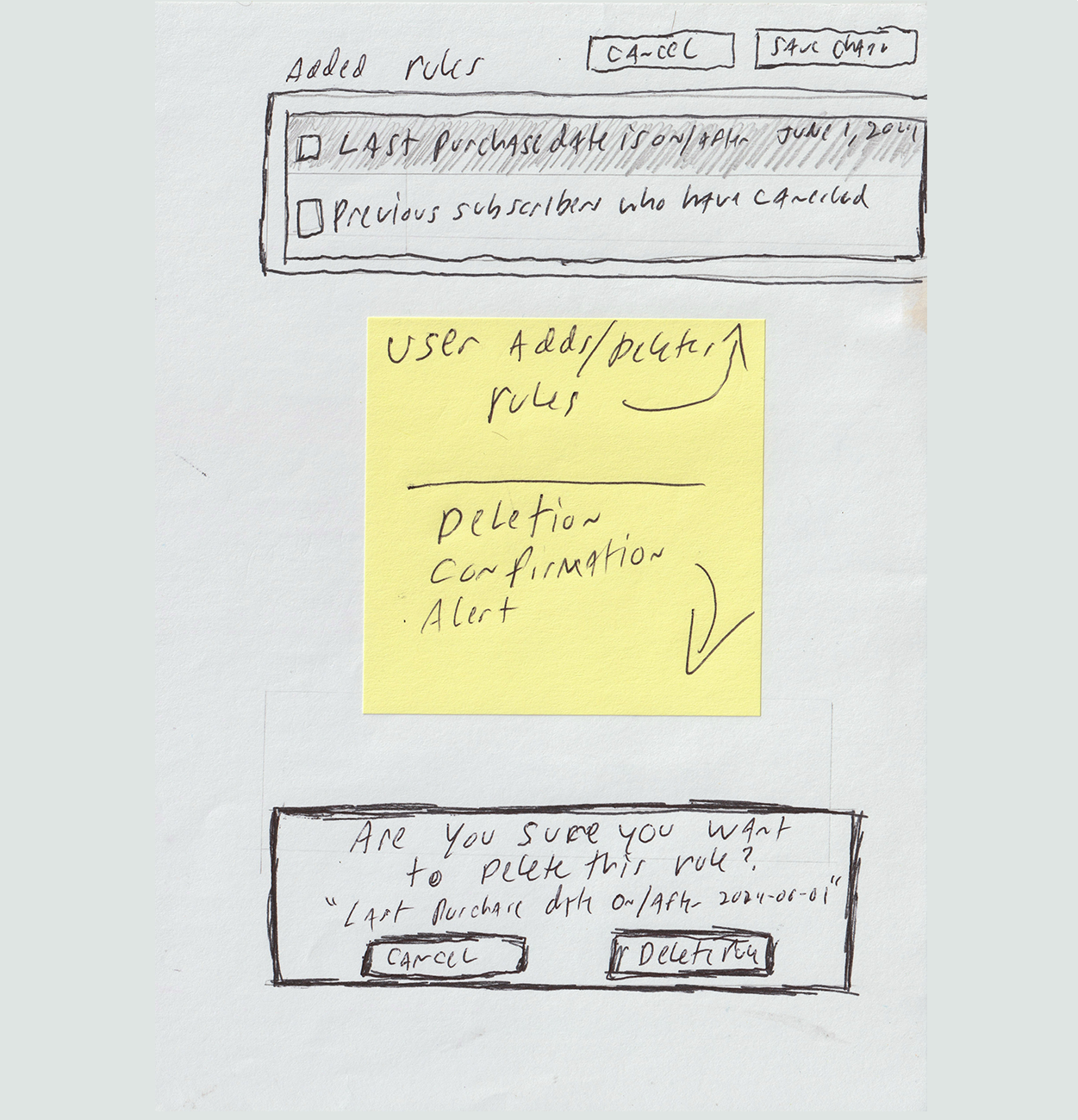
Reconstructed original experience showing how technical rule logic was exposed through field, operator, and value inputs.
Project Information
- Category :UX Design / Internal Tools
- Platform :API-driven ECRM System
- Role :UX, UI, Front-end
- Status :Concept & Ongoing Iteration
Overview
Velora Engagement Engine is an internal marketing platform used to build audience segments for email campaigns via an API-driven interface. Internally referred to as the "Engagement Engine," the tool sits at the center of how marketing teams define who receives what message — and when.
The platform integrates with an enterprise CRM and exposes a rule-based query builder to non-technical marketers. The problem: it was built by and for engineers, and it showed.
Referred to internally as the “Engagement Engine” to reflect its role beyond audience creation.
The Problem
The original interface surfaced raw API structure directly to users — database table names, query operators, and bare parameter syntax — with no contextual guidance. Users had to understand the underlying data model just to define a basic audience segment.
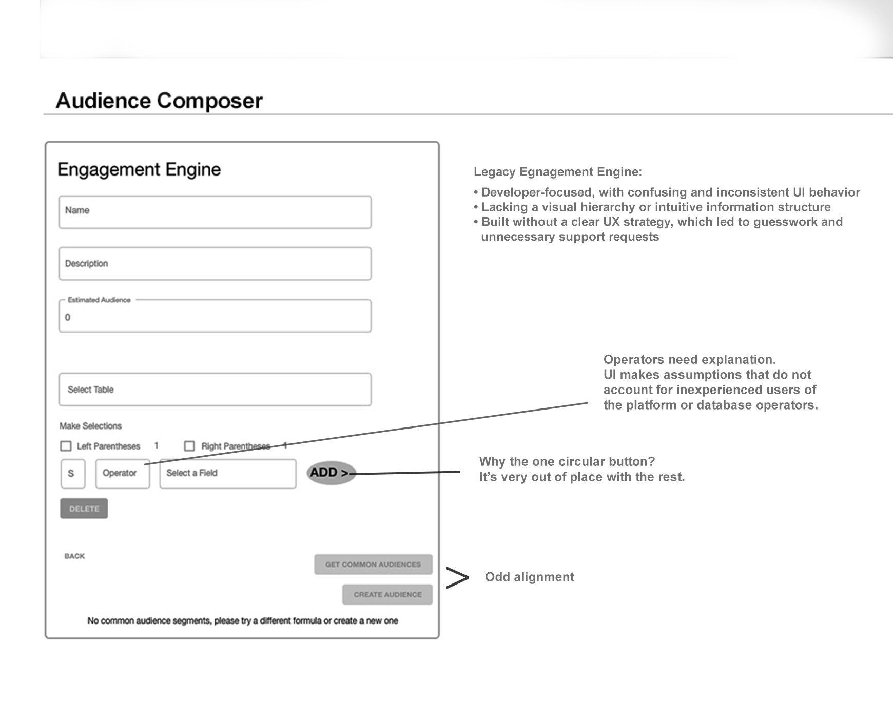
- Oversized "ADD ▶" button dominated the visual hierarchy, drawing attention away from the actual workflow and implying it was the primary CTA when it was a row-level utility.
- Left/Right Parentheses checkboxes exposed raw query grouping syntax with no explanation. Non-technical users had no mental model for what these did or why they'd use them.
- No clear starting point — "Select Table," operator row, and ADD all sat at the same visual weight, leaving users unsure where to begin.
- Disabled CTAs with no explanation — "GET COMMON AUDIENCES" and "CREATE AUDIENCE" were grayed out with no indication of what needed to happen first to enable them.
- Dual primary actions — "TACTIC SETUP" vs. "SAVE" — both styled the same, with no visual distinction between a configuration action and a save action.
Discovery
Research was conducted through direct observation and structured conversations with colleagues who used the tool regularly as part of their daily marketing workflows. No formal usability testing was conducted — this was a lean, internal initiative — but the patterns that surfaced were consistent and specific.
"I have no idea what a filter_query_object is. I just copy what someone else did and hope it works." — Marketing coordinator, regular platform user
"I've broken audiences before by clicking the wrong thing. Now I screenshot everything before I save." — Marketing ops team member
Lisa M. — Marketing Coordinator / Intermediate User
Comfortable with email platforms like HubSpot, but not confident with technical query logic. Relies on workarounds and copies previous audience definitions rather than building new ones from scratch. "If I can't tell what a button does, I don't click it."
Dana W. — Marketing Ops / Power User
Understands the data model but frustrated by the time cost of managing complex rule sets. Regularly uses external documentation and manual workarounds to do things the UI should handle automatically. "I know what I want to do — I just shouldn't need a cheat sheet to do it."
Early Design Questions

Before moving into wireframes, I mapped the recurring usability questions that came out of discovery:
How can users verify what a rule means?
Should advanced options be hidden by default?
How can the interface reduce accidental changes before an audience is created?
Key Design Decisions
Rather than a feature list, here are three decisions that defined the redesign — each with the problem it solved and the tradeoff considered.
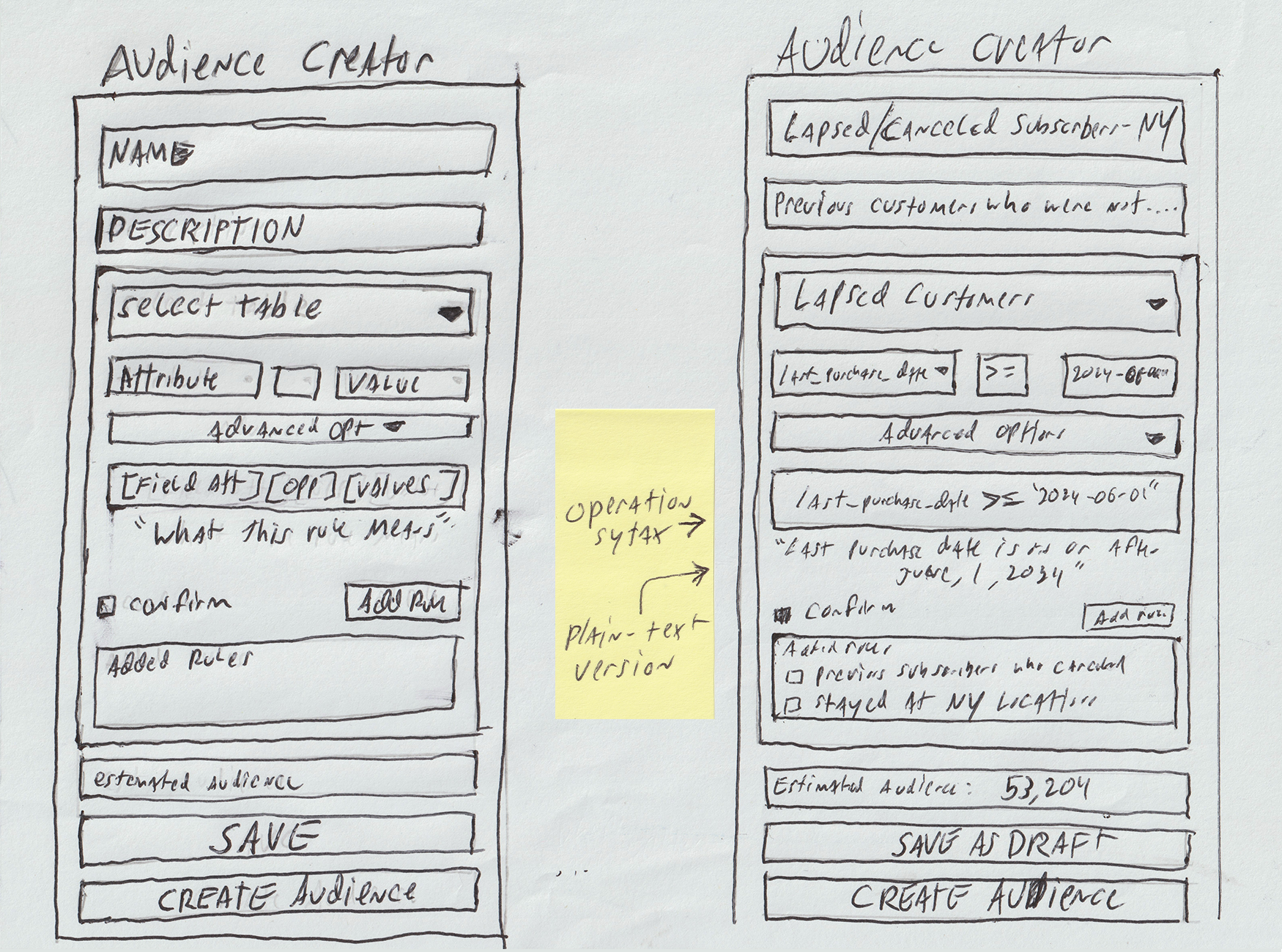
Decision 1 — Plain-English Rule Preview
- Problem: Users saw raw API syntax (last_purchase_date >= '2024-06-01') and had no way to verify what their rule actually meant before adding it.
- Decision: Show the API syntax and a plain-language translation simultaneously — e.g., "Last Purchase Date is on or after June 1, 2024" — before the user confirms the rule.
- Tradeoff: Generating accurate translations requires mapping every operator and field to a readable string — a non-trivial engineering investment. Scoped to the most common operators for phase one.
Decision 2 — Progressive Disclosure for Advanced Options
- Problem: Parentheses grouping controls were always visible, adding visual noise and confusion for users who never needed them.
- Decision: Collapse advanced options behind an expandable toggle, shown collapsed by default. Power users can access them; everyone else never sees them.
- Tradeoff: Considered always showing them with better labels instead. Discarded — the root issue was discoverability, not labeling. Hiding by default was the right call for the primary user type.
Decision 3 — Confirmation Gate + Destructive Action Safety
- Problem: Rules could be added or deleted without confirmation, leading to accidental changes that were hard to undo. Users reported screenshotting before saving as their primary error-prevention strategy.
- Decision: Require a "Confirm this rule" checkbox before ADD RULE activates. For deletions, surface an inline modal that quotes back the rule being deleted — making the consequence explicit before anything is removed.
- Tradeoff: Adds a step to the flow. Accepted — the cost of an extra click is far lower than the cost of rebuilding a broken audience definition.
Design Flow
The redesigned Audience Creator walks users through a structured sequence — from empty state to confirmed audience — with feedback at every step.
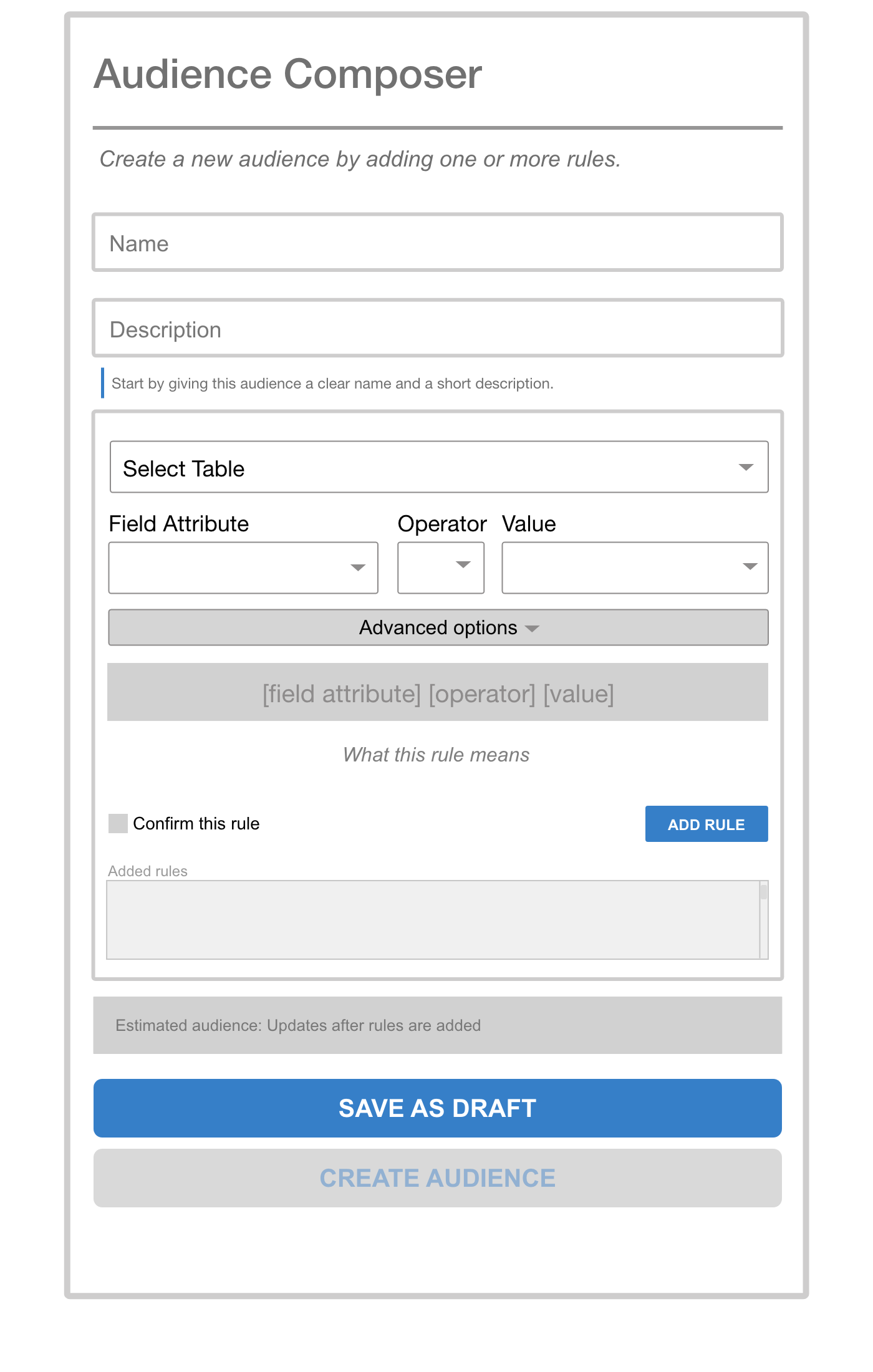
Clear entry point. Name and describe the audience before building rules. CREATE AUDIENCE is disabled until at least one rule exists.
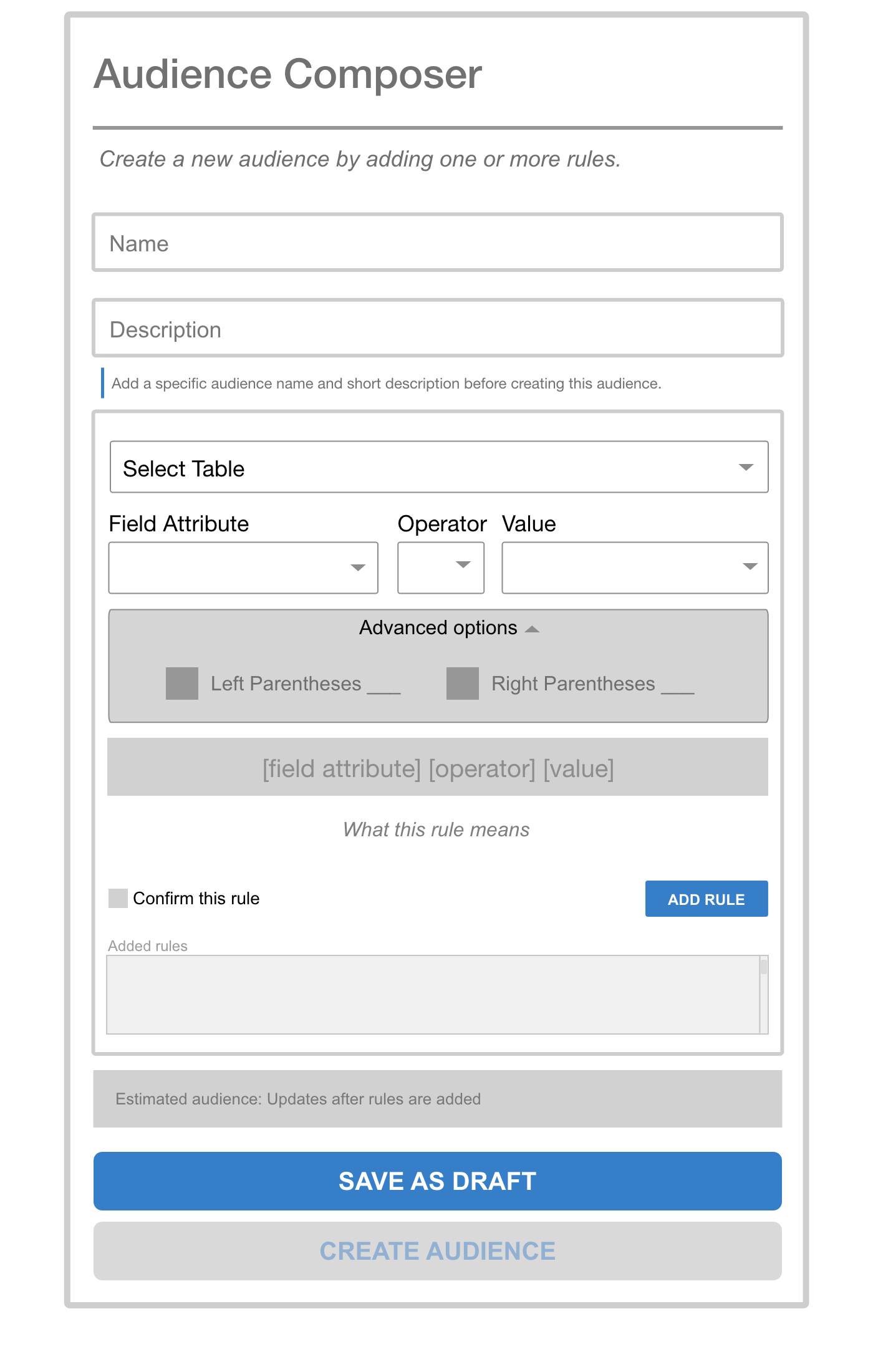
Parentheses grouping is hidden by default. Power users can expand it; everyone else never sees it.
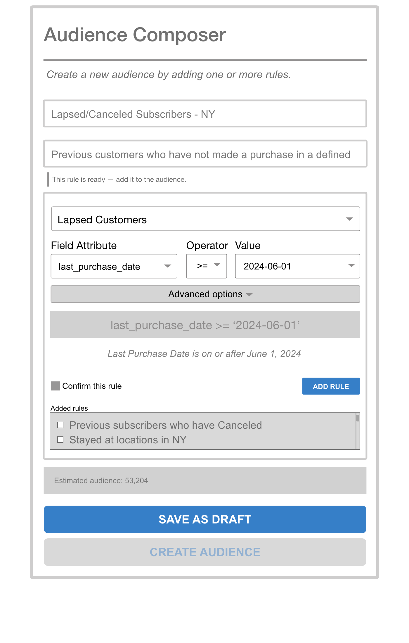
As selections are made, the API syntax and a plain-English translation both appear. "Confirm this rule" must be checked before ADD RULE activates.
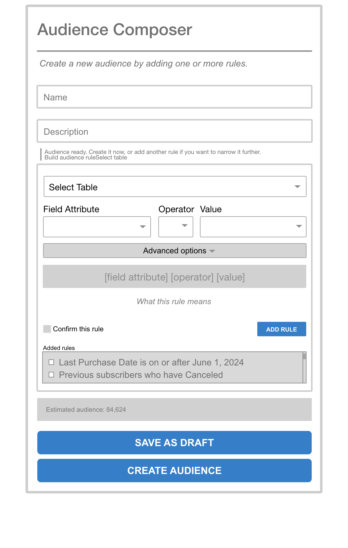
Confirmed rules appear in the Added Rules list using plain language — not API syntax. Estimated audience size updates automatically.
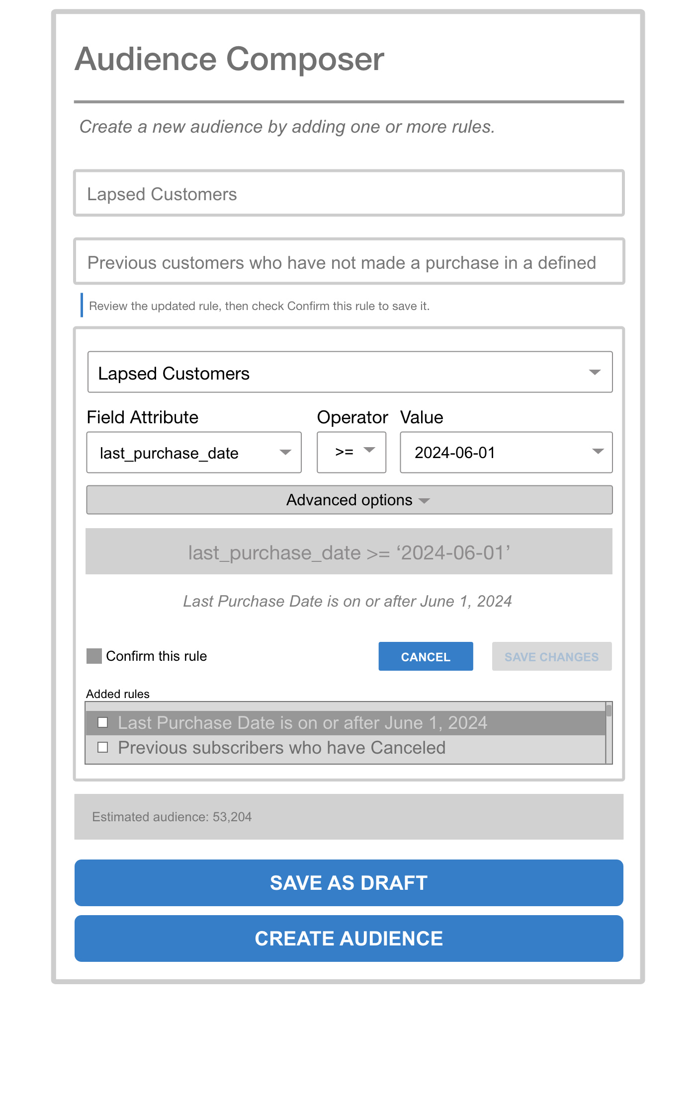
Selecting a rule surfaces EDIT RULE and DELETE RULE contextually. Editing loads the rule back into the builder with Cancel and Save Changes — no need to delete and recreate.
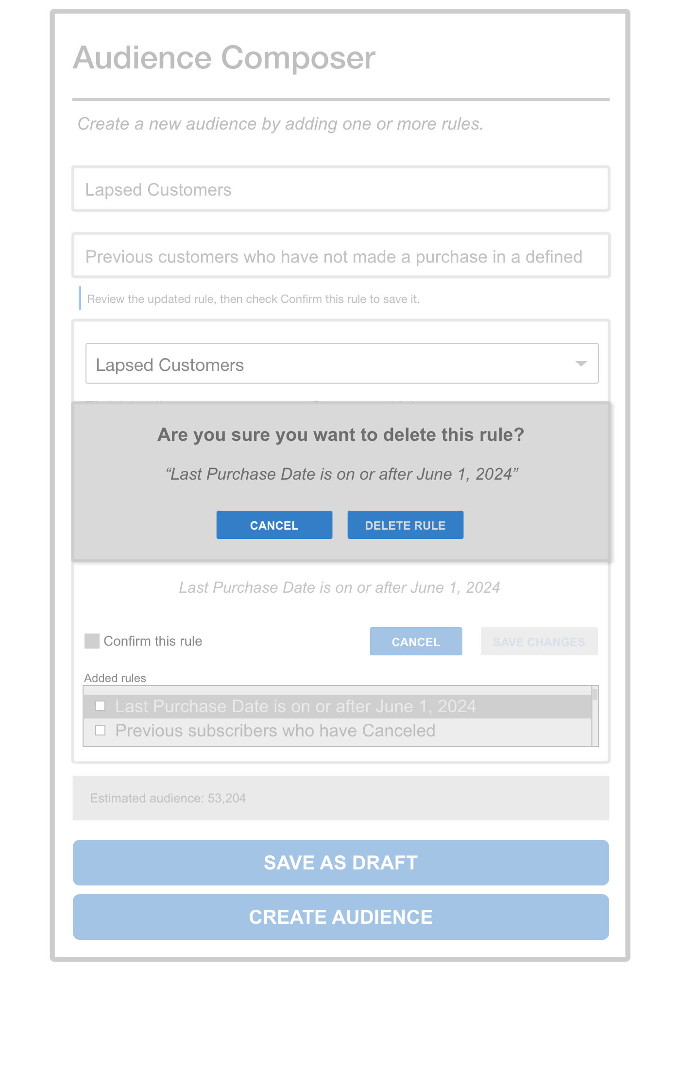
Deletion surfaces an inline confirmation that quotes the rule by name — making the consequence explicit before anything is removed.
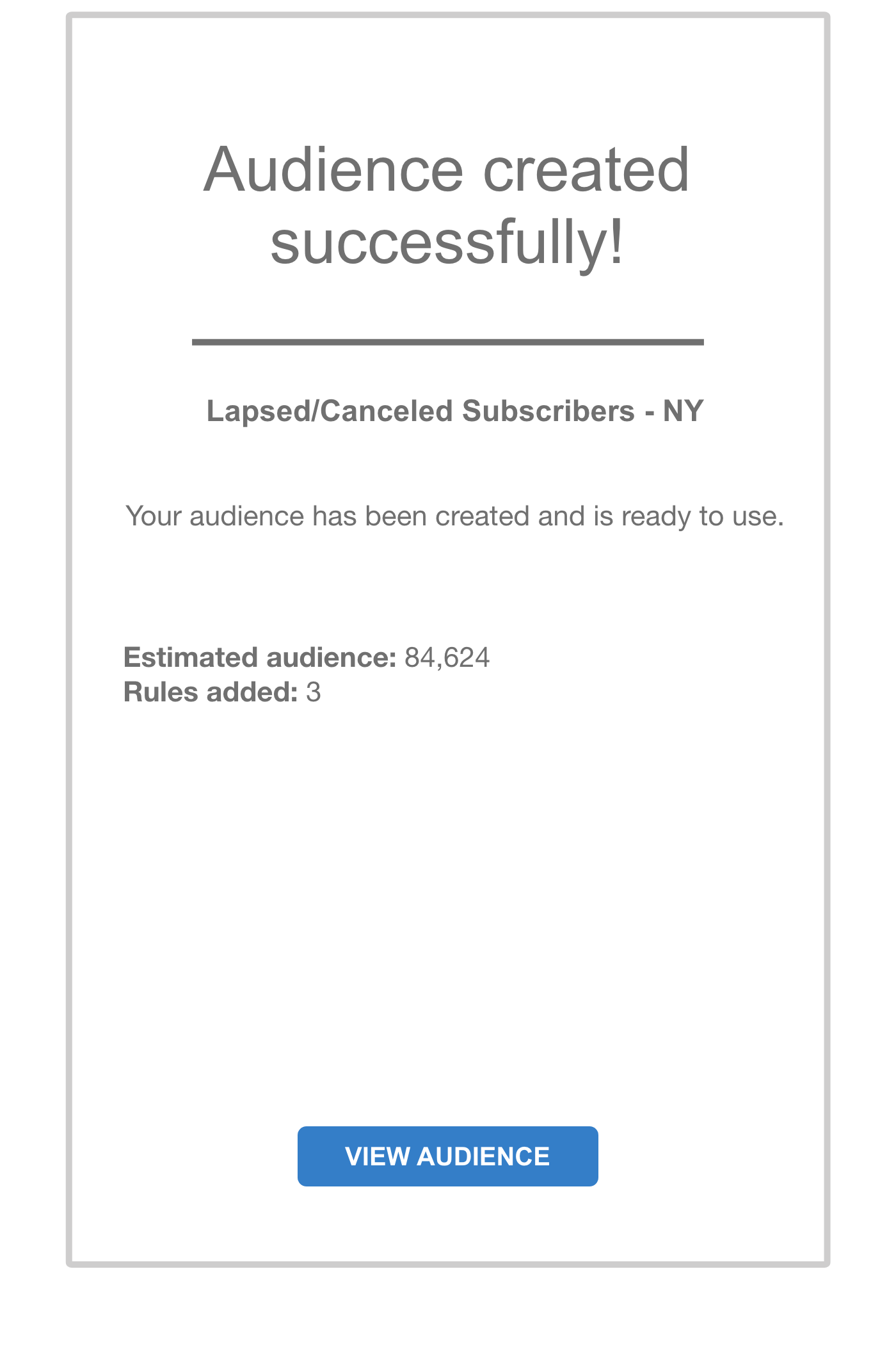
A dedicated confirmation screen closes the loop — audience name, estimated size, and rule count are confirmed. No ambiguity about whether it worked.
Outcomes
Note on methodology: This was a lean internal initiative without access to formal usability testing infrastructure. Outcomes below reflect directional findings from structured prototype walkthroughs with regular platform users, not controlled measurement. They establish a baseline for future iteration.
- Reduced documentation dependency — users completing prototype walkthroughs were able to define audience rules without referring to external documentation, compared to consistent reliance on it in the original flow
- Improved rule confidence — the plain-language translation was cited by every walkthrough participant as the single most helpful addition
- Eliminated the "screenshot before saving" workaround — the confirmation gate and delete modal directly addressed the primary error-prevention behavior users had developed on their own
- Established a reusable pattern — the progressive disclosure and validation model is designed to scale to other rule-based interfaces in the platform
Reflection
The most valuable lesson from this project was that the users' workarounds were the real design brief. Screenshotting before saving, copying existing audiences instead of building new ones, keeping a personal cheat sheet of operators — each of those was a signal that the system had failed to communicate something it already knew. The redesign's job was to surface that knowledge where users needed it, not hide it behind documentation.
Given more time and resources, I'd prioritize two things: first, formal usability testing with a broader set of users to validate the plain-language translations across the full operator set; second, exploring whether common audience templates could reduce the number of times users need to build from scratch at all.